
soy candle brand identity
01. brand concept
Brand of soy candles named RADJA originates from the ancient Sanskrit language and translates as “Ruler”.
“You are in charge of your reality” is the brand’s slogan, vividly reflecting the philosophy that each person has the inner strength to control their life. The goal is to inspire you to simply be and feel, enriching your inner energy and self-awareness.
The light of our soy candles creates an atmosphere of comfort and tranquility to help you focus on your goals. We deeply believe that a state of inner relaxation and harmony is the key to confidence and happiness in everyday life.
Each RADJA candle is accompanied by a special message that will serve as a valuable guide for you in the process of self-discovery and achieving inner harmony.
02. visual identity
logotype
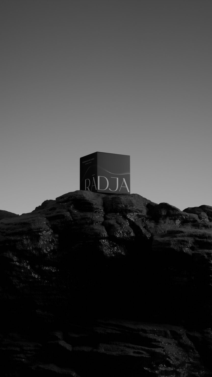
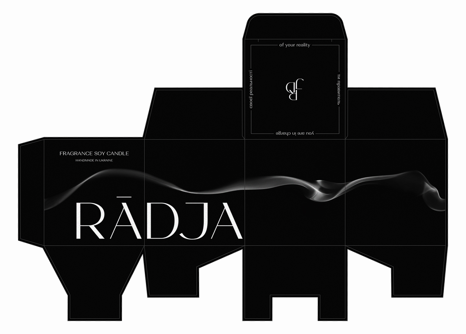
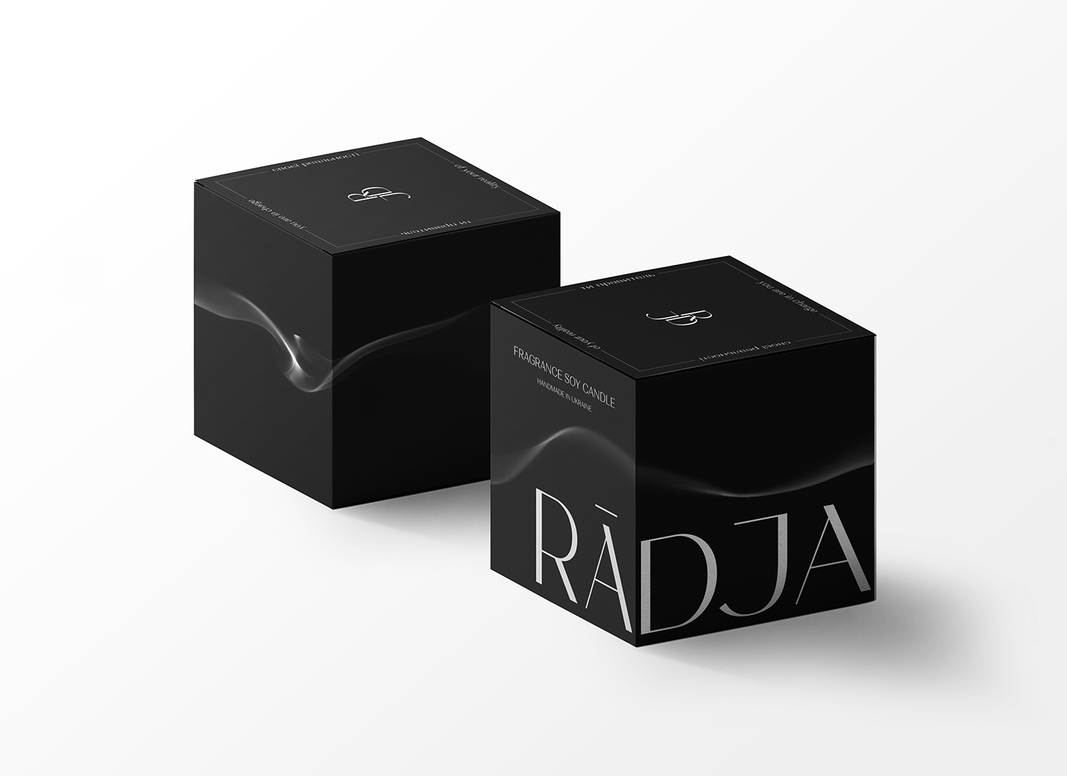
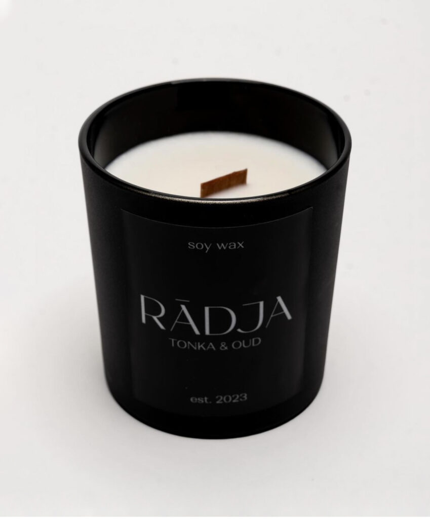
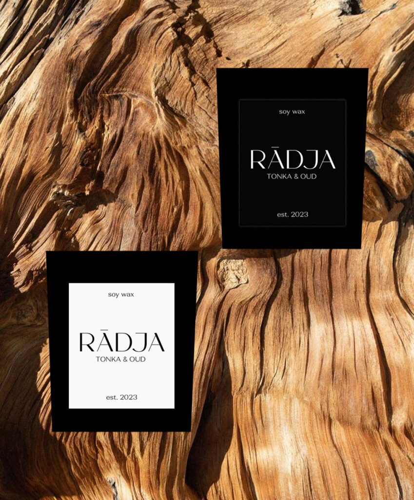
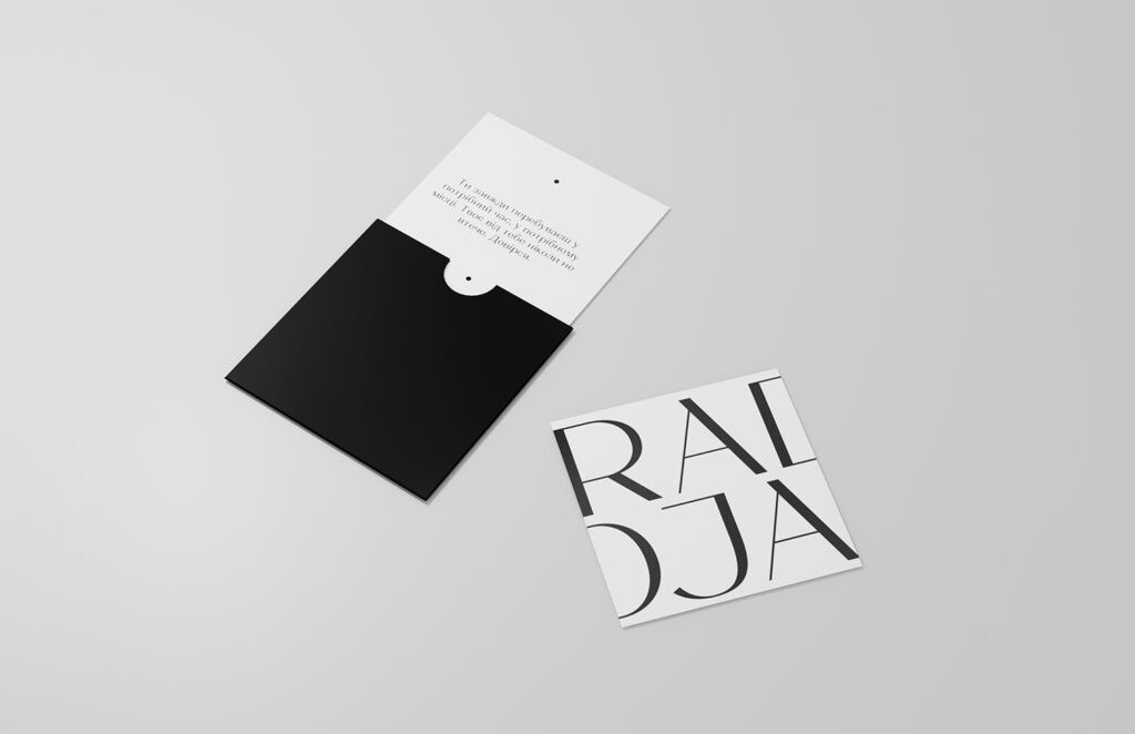
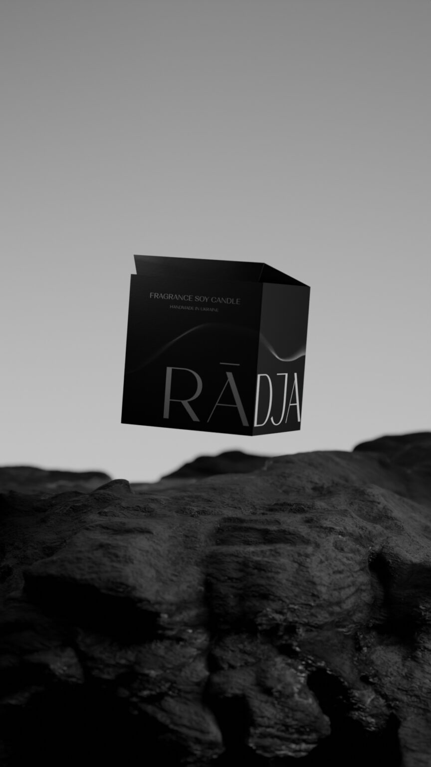
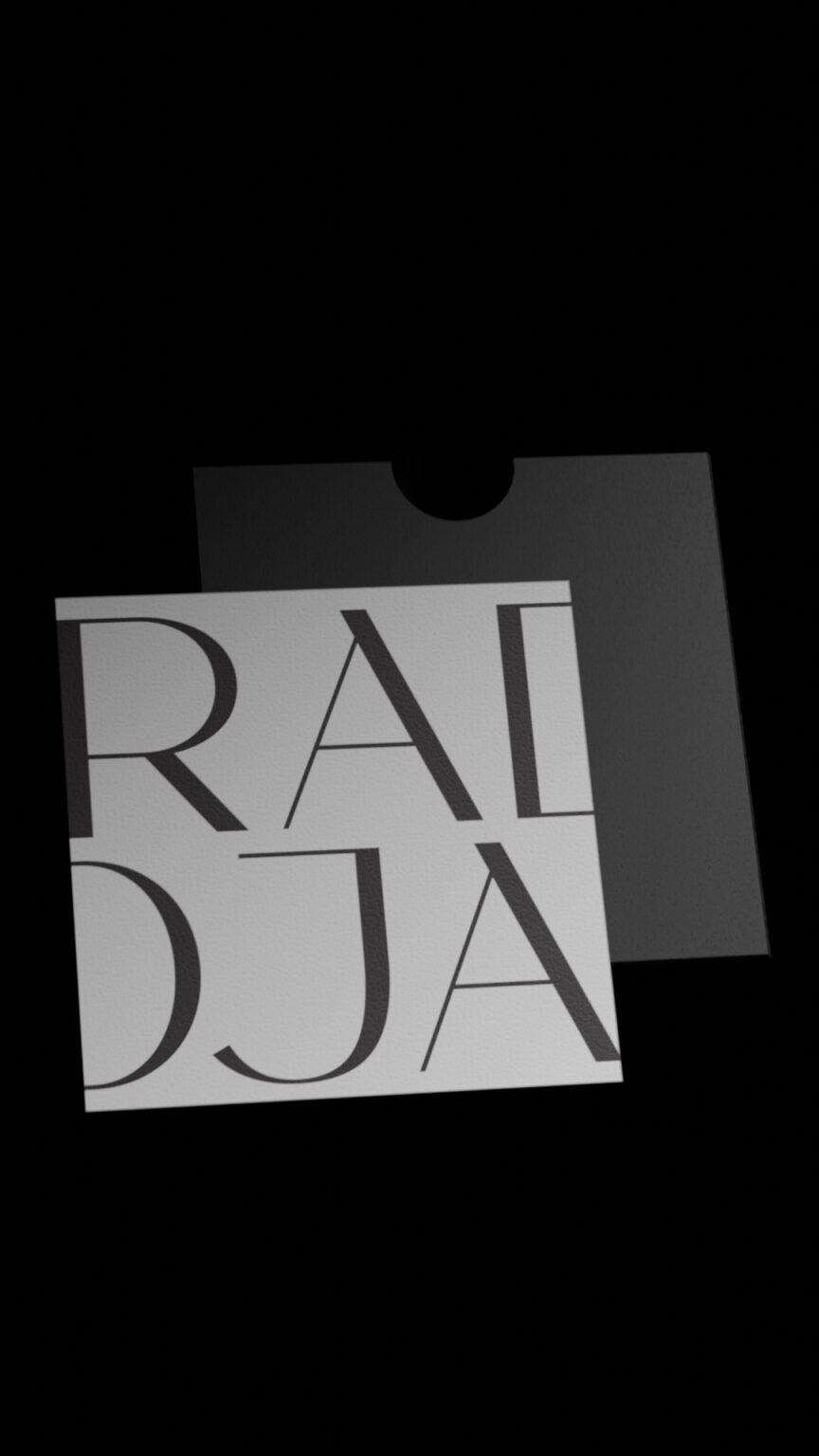
The first version of the RADJA brand logo is characterized by a calm and clear design. Above the letter “A” is a line that reproduces an element from the original word राज, rāja.
Through its minimalist approach, the logo conveys a focus on primary goals and asserts a strong inner resilience that helps overcome obstacles and achieve success.
The second version of the logo embodies the smoothness of smoke, symbolizing lightness and harmony. The focus on one’s uniqueness and inner aspirations becomes the main idea of this design.
acronym logotype
color palette associations
typography
Accent Font ALETHIA NEXT
BROWN SUGAR & FIG
Complementary Font MONTSERRAT
The first fragrance is “Seduction.”
Notes of burnt sugar and saltiness, with an unusual shade of fig and its juiciness.
elements


03. social media concept
MAIL: [email protected]
INSTAGRAM: @ma.wo_